This website uses cookies
This website uses cookies to enable it to function properly and to analyse how the website is used. Please click 'Close' to accept and continue using the website.


March 2016 - 1 Poultry, City of London
by Owen Hopkins
One of the key moments in my recent book on the architecture and ‘afterlife’ of the great English Baroque architect, Nicholas Hawksmoor (1662–1736), comes towards the end, when the story reaches the 1950s and 1960s. These decades saw the first scholarly attention paid to Hawksmoor, who up until then was still seen as a second-rate talent. At the same time, though in a way quite independently, Hawksmoor was discovered by the generation of architects then just coming of age: those who had been trained in the Modernist tradition, but felt increasingly constrained by its strictures. In Hawksmoor’s enigmatic creations they saw a free creative spirit which revelled in the material qualities of stone, the expressive possibilities of geometry, and the capacity of architecture to work on an emotional as well as functional level.
Despite this profound interest, it is hard to think of any building from that period that could be described as definitively ‘inspired by’ Hawksmoor. It took a few more decades for a building with the requisite geometrical force and weight of allusion to appear. But when it did, in the form of James Stirling’s final masterpiece, 1 Poultry, there would be no mistaking its decidedly Hawksmoorian power and vigour.
In some ways this is no surprise. Stirling was a great Hawksmoor aficionado throughout his career, though when researching the book I struggled to find many instances of him actually discussing Hawksmoor’s work. But it surely would not have escaped Stirling’s attention when taking on the commission for 1 Poultry that the site looking over the Bank interchange lies not quite opposite Hawksmoor’s St Mary Woolnoth, his only church in the City of London. If you stand in the middle of the road, it is just about possible see both buildings in your peripheral vision. It’s a fitting way of viewing two buildings that frequently echo each other but always at a remove, like architectural cousins related across time.
The story of the site of 1 Poultry is a complex one. In the early 1960s the developer, Peter Palumbo, commissioned a design from no less a figure than Mies van der Rohe. Mies’s scheme was for a Seagram Building-like tower, with a public piazza in front. Planning permission was granted in 1969, but construction would have to wait until the early 1980s when the leases on the required plots would expire. But during the intervening period the architectural climate in Britain would change radically. As Palumbo tried to move his plans forward, he was met with a passionate campaign to save the Victorian Mappin and Webb building that occupied the site, high profile planning inquiries, and a damning mention of the scheme in Prince Charles’ infamous ‘carbuncle’ speech at the RIBA in 1984. The following year the Mies scheme was finally thrown out. Faced with this hostility, some developers might have simply sold the site and walked away. However, Palumbo was undaunted and turned to Stirling, whose career was once again on an upward curve after winning the Stuttgart Neue Staatsgalerie competition in 1977. Like that project, 1 Poultry belongs to the phase of Stirling’s career which is often related to Post-modernism, though he himself rejected the label.
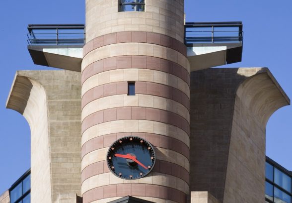
1 Poultry occupies the wedge-shaped site formed as Poultry and Queen Victoria Street converge at Bank. The apex of the wedge is one the most arresting architectural sights in London, looking out across the interchange like the prow of a ship. It comprises a tall archway topped by a sharp wedge of glazing, with a stone cylinder and transverse viewing deck above. This is then bolstered either side by the concertinaing of the powerfully layered side façades that form the building’s street elevations. Looking at one of these great elevations from across the street, there is the unsettling effect of simultaneous lightness and heaviness. At ground level, two series of piers wrapped in the two-tone sandstone veneer, which clads all of the building’s exterior, support huge slabs of grey granite either side of a lopped triangle opening that leads to the interior light-well. Above this level, the sharp wedge of glazing from the building’s apex reappears but here opened out, like the cover of a book. Somehow appearing both translucent and opaque, the glazing provides a well-judged foil to the great mass of the central drum that runs vertically through the whole composition.
In the abstract, we might see Stirling’s approach as simply taking the geometrical force of his early work, the Engineering Building at the University of Leicester for example, and intermixing a range of historical references and allusions: a terracotta frieze salvaged from a demolished building on site; echoes of the Roman ruins discovered on the site; an extraordinary Scala Regia-inspired staircase that leads one up the building’s levels. But what differentiates Stirling’s approach at No. 1 Poultry from typical Postmodern eclecticism is that the meaning of these references and allusions does not emerge arbitrarily, but through their powerful connections to the site. So when I look towards the building’s apex, amid the confluence of forms and references is in fact a distorted version of the west front of St Mary Woolnoth: a tall arch defining the first level; rustication abstracted to an eerily austere plainness; a composition that does not diminish in scale as it proceeds up, but grows in physical and metaphorical weight; indeed, the very idea of a building of such resonant allusions and geometrical force.
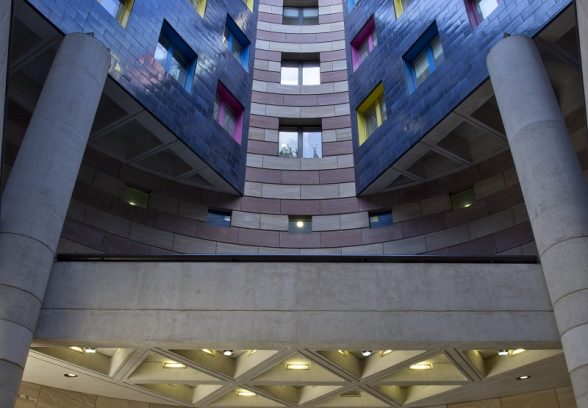
To call 1 Poultry an architectural collage, or montage, or even decoupage, as some are prone to label Postmodernism, belies its extraordinary spatial complexity. To appreciate this, one only need walk along Poultry and find oneself within the building’s envelope without having consciously left the street. Passing through the triangular opening the ceiling lowers and the light level drops dramatically. Taking a few steps further, the feeling almost of foreboding that one has with this great weight of stone and history above is sensationally reversed upon entering the light-well that’s placed within the central drum and bathed in a dreamy, reflected light. It’s here that the connection to St Mary Woolnoth is most profound. There, one similarly crosses the threshold of the towering exterior to enter an outer ring of interior darkness before being met quite unexpectedly by a central pool of light pouring in from four lunette windows, which, like the light-well at 1 Poultry, are invisible from outside. Hawksmoor never had Stirling’s swagger; he confined himself to a material palette of Portland stone and cream stucco. Stirling, however, ran the full gamut: the two-tone sandstone banding; a variety of concrete finishes; blue glazed bricks; and window reveals in bright blue, hot pink and lemon yellow.
At their best, as I think they both are at 1 Poultry and St Mary Woolnoth, Stirling and Hawksmoor were capable of creating architecture at its very purest: ideas embodied in form and mass through the means of geometry and light. The vandalism in the 1920s and 1930s which robbed us of John Soane’s Bank of England is of lasting regret not just to the City of London, but to world architecture. It will be a scandal of equal proportions if today we allow changes, however superficial they appear, to Stirling’s No 1 Poultry – the great building of late-twentieth-century London.
Owen Hopkins is Architecture Programme Curator at the Royal Academy of Arts and author of From the Shadows: The Architecture and Afterlife of Nicholas Hawksmoor
Look for past Buildings of the Month by entering the name of an individual building or architect or browsing the drop down list.

Become a C20 member today and help save our modern design heritage.