This website uses cookies
This website uses cookies to enable it to function properly and to analyse how the website is used. Please click 'Close' to accept and continue using the website.


May 2009 - Ulster Museum, Belfast
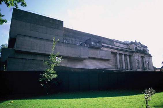
In 1913, a competition was held to design a new building to house the then Belfast Museum and Art Gallery’s expanding collections. James Cumming Wynnes of Edinburgh won the competition judged by Sir J J Burnet, but the First World War delayed construction and only one end of that large and ambitious scheme was completed, opened in 1929.
In 1962, the museum was renamed the Ulster Museum, with the intention that it should not simply be a local museum for Belfast, but for the whole of Northern Ireland. This led to a competition being held in 1964, won by Francis Pym of London. Interestingly, at the time, Alistair Best commented in the journal Design that, other than a “science fiction fantasy” of “up-ended cones in a forest of circulation towers” by Ron Herron, which came joint-second, “there were few remarkable entries”.
Huge, seemingly random, entirely featureless rectilinear blocks of shuttered concrete, now weathered slightly black and green, express the layout of galleries behind the extension’s facade, creating an awesome and stark contrast with the classical 1929 wing in a clever and original way: the completed whole likened by others to a half-completed sculpture. Classical features of the original building may have been extended towards the extension’s concrete cantilevers with the intention of sensitively blending the two styles together (at the request of Belfast city planners of the time); however, the concrete galleries seem to collide with and envelop the classical detail. In spite of all this, the classical proportions of the original design are still evident and maintained in the massing of the extended whole – deliberately or otherwise. The building is a landmark, inspiring, uplifting and idealistic. Alternatively, some would argue that it is hard to relate to, overbearing and uncommunicative… Both arguments carry weight.
Pym seems to have been influenced by works such as Mies van der Rohe’s Karl Liebknecht monument in Berlin, 1926, and there are conceptual similarities between Pym’s design and Boston City Hall, by Gerhardt Kallmann and N Michael McKinnell, started in 1962 and completed in 1969. I wonder whether Zaha Hadid found inspiration in south Belfast when designing the Rosenthal Center For Contemporary Art, Cincinnati, Ohio, 2003? Or perhaps Grafton Architects at Progetto Universita’ Bocconi, Milan, 2008?
The low and wide 1972 entrance foyer was starkly modernist in form and finish. At the far corner of the foyer was the tall, impressive engineering hall: the first of an ascending spiral of galleries that cleverly worked in harmony between both the original wing and the extension. As throughout this helical progression, just a few steps led up to the engineering gallery. This was perhaps the most impressive internal space: a sudden contrast with the low foyer, framed by vast blank expanses of neutral and unnoticeable shuttered concrete. The interface between the engine hall and the central courtyard was softened by pools of water crossing between inside and out, where visitors threw their spare coppers before moving on.
Over the years, alterations were made which began to have some effect on the building’s character, such as the painting of internal concrete walls, though in many cases to make way for additional gallery space. In 2005, a major refurbishment was announced, due to be completed later this year. There has been discussion in the local heritage community in relation to the refurbishment proposals. Suffice to say that the extent of internal alterations to the Pym extension is surprisingly comprehensive, given the building’s acknowledged significance and protected status. Original walls have been removed, the water feature is rebuilt in a different form, the courtyard re-covered, apparently blocking natural light to other rooms and galleries, the original helical circulation done away with, and substantial new steel and glass elements inserted, in contrast with the materials of both the 1929 and 1972 “wings”. The restoration to gallery display space of parts of the building partitioned into offices for years is welcome, and the creation of a café at ground level would seem to be a positive intervention, in principle.
The Ulster Museum building is more than a place to peer at paintings or to learn about radioactive rock; it is a rare architectural icon in a city that knows few c20th buildings of such distinction. A balance has been struck between exhibition needs and the architectural heritage of the structure. On the basis of historical and contemporary photographic evidence and project proposals, not to mention public outcry, the balance is surprising, as a considerable amount of the building’s character would seem to have been lost. How such comprehensive internal reconfiguration was permitted by the authorities has already been questioned by others. Nevertheless, the alterations were approved, and the refurbishment,over two years in progress, is now nearing completion. This article is written primarily to further raise awareness of this building’s significance. That which remains of its original fabric – by both Wynnes and Pym – must be protected from further loss.
Look for past Buildings of the Month by entering the name of an individual building or architect or browsing the drop down list.

Become a C20 member today and help save our modern design heritage.