This website uses cookies
This website uses cookies to enable it to function properly and to analyse how the website is used. Please click 'Close' to accept and continue using the website.


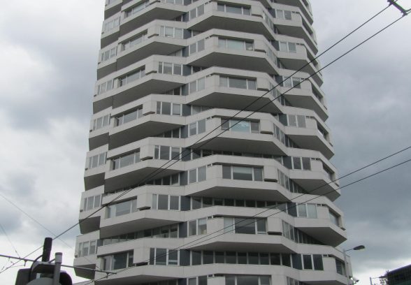
The Twentieth Century Society is disappointed and surprised by the decision issued last week not to list Croydon’s iconic ‘three penny bit’ building. It follows our application to add the building to the statutory list in August 2012.
We will be requesting a review of this decision from the Secretary of State, which came after English Heritage’s advice that Croydon’s landmark 1960s office building did not meet the criteria for grade II on architecture and planning grounds.
“This was a chance to put Croydon on the post war heritage map, and celebrate and protect one of Seifert’s best remaining examples of sculptural concrete in the UK, ” said Henrietta Billings, senior conservation adviser, Twentieth Century Society.
“The largely unaltered composition of the tower, water feature and concrete landscaped setting make it an outstanding 1960s building, on a par with Centre Point. We are extremely disappointed with the decision not to list and will be seeking a review from the Secretary of State,” she added.
No. 1 Croydon (former NLA building), built in 1968 by Siefert and Partners is regarded by the Twentieth Century Society as one the practice’s best remaining works. This is not only due to the dramatic sculptural effect of the geometric exterior – which gives the 23 storey tower its nickname. Where the original water fountain at Centre Point has been demolished, the hard landscaping area with external seating, signature Seifert steps, and former water fountain are all still in-tact in Croydon.
The whole building – including cills and sofits is clad in three different types of mosaic tile. And from the sunken piazza which it stands in, you can see close up the great cruciform pilotis, which as pointed out in the English Heritage report “suggest a ring of giant Atlas -like figures, holding the tower aloft on their straining shoulders”.
The design of the tower is an unusual geometric and symmetrical composition, made up of two square floor plates placed at 45 degree angles, with splayed corners, giving the building 24 sides and a strong rhythm of canted bays projecting in alternating positions. The effect of rotating the floors and projecting bays results in the impression of being circular, with bold projecting facets, but has the advantage of having office floor plans that are almost square.
The tower was designed for a specific client, Noble Lowndes Anninuities, a pension brokers. Noble Lowndes was a New Zealander who came to the UK after the Second World War and along with his 3 brothers founded Noble Lowndes and Partners Ltd which became one of the UK’s most successful pension consultancies. The brief for the architects was to provide a prestigious 23 storey tower block of ‘distinctive appearance’ together with maximum possible car parking storage below ground.
The building has also inspired this artwork, left, created with thread by Peter Crawley.

Become a C20 member today and help save our modern design heritage.