This website uses cookies
This website uses cookies to enable it to function properly and to analyse how the website is used. Please click 'Close' to accept and continue using the website.
Much of C20 architecture is characterised by unique details. This series of photographs accompanied by their authors’ thoughts is a regular feature on our Instagram and celebrates them including unusual facades, striking lighting and distinctive decorative elements from around the world.
Margherita Manca
Instagram: @margsmanca
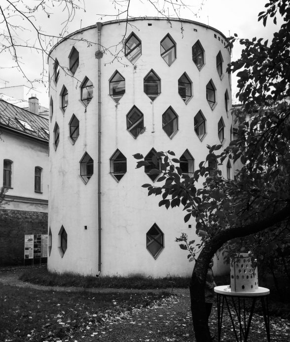
A C20 detail that I love are the dozens of evenly distributed hexagonal windows of the cylindrical Melnikov House in Moscow.
I like their symmetrical display and how they let in an extraordinary amount of brightness into this most unusually shaped home.
The house was built in 1927-9 by the avant-garde architect Konstantin Melnikov who lived there with his family but it had initially been pitched for planning permission as an innovative prototype for communal housing.
The unconventional shape of the window embodies Melnikov’s ethos as an architect who resisted traditional forms but still carefully devised innovative constructions to ingeniously make the most of space and light.
Before building this house, Melnikov worked prolifically for the Soviet government until the 1930s, notably designing a sarcophagus for Lenin’s body in 1924, and co-designing, with the artist Alexander Rodchenko, the Soviet pavilion for the International Exhibition of Modern Decorative and Industrial Arts in Paris in 1925.
Melnikov House – Дом Мельникова – is now a museum open for guided tours only which I highly recommend visiting, on a sunny day if you can!
Margherita Manca is a design historian and Communications Cfficer at the C20 Society. Her recent research has focused on C20 American industrial building architecture.
Of all the early modernisms, it is the Dutch version I find most appealing. For me, it sits somewhere between the hard German manifestations and the softer humanism of Scandinavian iterations.
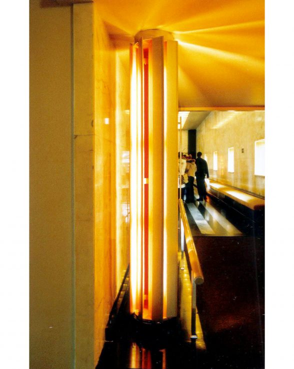
One of my favourite modernist Dutch buildings is the magnificent Hilversum Town Hall (1931) by Willem Marinus Dudok.
Its exterior clearly owes a lot to Frank Lloyd Wright, but it is the restrained material opulence of the interior spaces that I find especially alluring.
The judicious application of gold, be it in textured wall coverings or mosaic clad columns, is rich, not brassy.
The timber linings and textiles are warm and sumptuous. The blue tiles in the central courtyard are the hue of a perfect summer sky. The whole ensemble reminds me of the Alhambra Palace – there is definitely a Moorish inflection to this civic composition.
Of all the details and finishes it is this light column that I especially recall. Pairs of them flank the doors to the Burgerzaal (Citizens’ Hall). Standard fluorescent lamps sit inside a perimeter of vertical louvres, whose inner faces are painted in a peach pink colour that reflects and adds a soft tone to the light emitted in an almost solar array.
There is a timelessness to the way this is put together and it stood out to me at the time and burned bright in my mind when I was asked to make this contribution.
Dudok is also a bit of a hero of mine. He was first chief planner of Hilversum, and then chief architect. I like the idea that he masterplanned where he wanted everything and then set about designing it! It’s not quite as neat as that, but his was a total creative vision as Lewis Mumford noted, “unlike many of his contemporaries, he did not attempt to narrow the province of architecture to that of the machine… the imagination of the artist himself, instead of being cramped by the material conditions to be fulfilled, was released by them.”
Richard Brook is an architect and historian whose research focuses on post-war mainstream and municipal modernism. He is the author of Manchester Modern (2017) and an advisor to The Modernist Society. His current projects include an examination of the intangible values of British post-war infrastructural landscapes.
Johny Pitts
Instagram: @johnymodern
Twitter: @johnypitts
Websites: www.johnypitts.com; www.afropean.com
As a ‘Blitz city’ with an industrial heritage, there was a spirit of optimism in Sheffield during the post-war years encompassed by City architect J.L. Womersley’s ambitious plans for a ‘new’ Sheffield (it was this vision poignantly revisited at the beginning of the film The Fully Monty).
In terms of Modernist architecture, there is therefore an embarrassment of riches in my hometown even if much of it remains under threat of demolition.
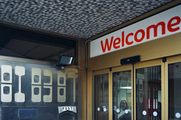
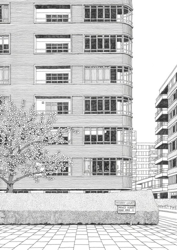
When I was asked to pick my favourite C20 detail my mind shifted past all the icons – the Park Hill Estate, the Arts Tower, the Moore Street electricity substation, even William Mitchell’s wonderful concrete reliefs – to a detail that I think embodied the spirit of this failed future better anywhere else: the entrance of Westfield House, occupying 87 Division Street.
I recently strolled past the building – built in 1973 and sold by Westfield in 2017 – and saw that they’d torn down the wonderful space age numbers in the entrance.
I sifted desperately through my photo archives and dug up this single image I have of them, taken in 2015.
Johny Pitts is a Sheffield-born writer, photographer, musician and broadcast journalist.
His debut book Afropean: Notes from Black Europe was published by Allen Lane last year. In its review, the Guardian said Afropean “announces the arrival of an impassioned author able to deftly navigate and illuminate a black world that for many would otherwise have remained unseen”. Afropean was a Guardian, New Statesman and BBC History Magazine Best Book of 2019 and in May this year it was awarded the Jhalak prize for the best book of the year by a writer of colour.
Johny founded and curates the award-winning online journal Afropean.com.
As a photographer, he has had work published by Cafe Royal Books and has been featured on The New York Times Lens Blog.
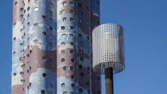
There’s an architectural and design marvel in Nanterre, a Paris suburb: Tours Aillaud, a group of residential buildings named after its architect, Émile Aillaud.
They are also known as Tours Nuages, the Cloud Towers, after their façade design, and were constructed in 1973-81 with the aim of “humanizing social housing”.
The enormous estate with 1,607 apartments in 18 buildings is now listed as Architecture Contemporaine Remarquable.
I like it because it rocks between modernism and postmodernism, playing with the contrasts and sizes: while some of the residential towers are of an enormous size, on the other hand, the organic cloud patterns consist of only 2 x 2 cm mosaic glass tiles, designed by Fabio Rieti.
The little detail that enchanted me during my visit in 2019 was to find the unusual water drop shape of the buildings’ windows repeated on the lampshades in the public space between the buildings where children were playing in a relaxed afternoon atmosphere.
Cordula Schulze is a linguist and editor who lives in Karlsruhe, Germany. With her camera, she’s been exploring C20 architecture in Europe and beyond. She mainly focuses on post-war modernism and brutalism.
Isle of Dogs sounds like an unlikely place to find this gorgeous detail, yet it’s there.
In a quiet residential street, hidden behind a tall brick wall stands a Grade II*-listed pumping station by John Outram, built in 1986-8.
It’s decorated by huge half-circle columns crowned by Outram’s wild take on Corinthian capital.
As the latest research confirms, ancient temples and sculptures were initially painted in vivid colours.
Outram’s use of bold colours thus unwittingly brought his reinterpretation full circle to the original.
Lukas Novotny is a London-based freelance illustrator and graphic designer. His first book, Modern London, was published in 2018. The C20 Magazine said: “Boasting over two hundred illustrations and 122 featured buildings, this illustrated guide to the capital’s modern architecture took its author more than three years to complete and it is clearly a labour of love.
Andrew Cadey
Instagram: andrewcadey; @campbellcadey
Websites: www.andrewillustrates.com ; www.campbellcadey.com
Whilst a few UK interwar apartment buildings – such as the Isokon, Pullman Court and Highpoint – successfully captured the minimalist purity of the early modernist movement, others appeared a little more tempered, perhaps for the sake of marketability.
Viceroy Court is, in my view, one such example where the architectural success is more in the detail, rather than the whole.
It is a mid-1930s mansion block that sits on the north western edge of London’s Regent’s Park and was designed by the architectural firm Marshall and Tweedy.
The building has a reinforced concrete frame and the main front is faced with golden brown bricks, cast stone trims and metal framed windows.
My favourite detail is the treatment of the court’s bookends, where the slimline metal glazing optimises the views out to the park, accumulating with a semi-circular cantilevered alcove in each of the living rooms that gives a visual weightlessness to the block’s main corners.”
Andrew Cadey’s interest in freehand drawing is symbiotic with his career as an architect. His stylistic preference is for face-on architectural vignettes that interpret the everyday and often overlooked built environment. Alongside being an illustrator, Andrew co-runs an architectural design practice, Campbell Cadey in Peckham.
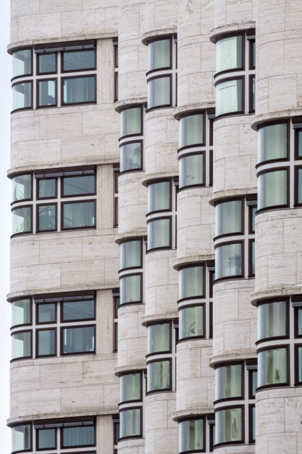
The Shell-Haus is an iconic building located near the Tiergarten in Berlin.
It was designed by Emil Fahrenkamp and built in 1930-31, the Weimar Republic’s last years of freedom before the Nazis came to power.
It is a beautiful example of expressionist architecture and grows both in height (from five to ten floors) and in length, following the direction of the nearby Landwehr Canal.
Its steel-frame structure is faced with travertine which serves to marry modern with traditional practices.
The most striking visual element is a swirl of seven curved corners which envelope the building like waves.
This detail is even more striking because of the curved glass of the windows, rendering the overall composition of the building completely unique.
In 2006, Roberto Conte started photographing abandoned spaces in his native Italy and focusing on architecture, from rationalist architecture to post-war modernism, brutalism and contemporary buildings.
His work has been featured in various magazines and newspapers (Domus, AD, Divisare, Repubblica and Architectural Digest) as well as books, including the ‘Atlas of Brutalist Architecture’ (2018) and ‘Soviet Asia’ (with Stefano Perego, 2019).
Conte regularly collaborates with architects, designers and artists.
He lectured at several universities in Italy and Denmark, as well as at the House of Architects in Nizhny Novgorod in Russia.
Become a C20 member today and help save our modern design heritage.
Comments