This website uses cookies
This website uses cookies to enable it to function properly and to analyse how the website is used. Please click 'Close' to accept and continue using the website.


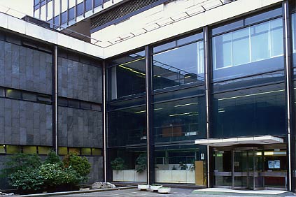
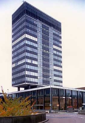
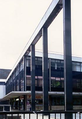
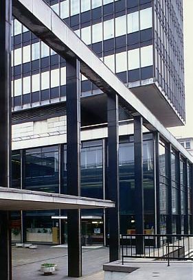
February 2002 - Birmingham Post and Mail Building
The Birmingham Post and Mail building was designed in 1960 by John H.D. Madin and Partners (partner in charge, D.V. Smith, project architects Ronald E. Cordin and Ramon K. Wood).. It’s an early example of a podium and slab block, inspired by the Lever Building in New York. It is also now the earliest surviving example of the type nationally as the Castrol Building in London has been altered and re-faced. But it’s more than just an office block, it’s an integrated newspaper production facility with the podium and slab offices linked to a separately treated but very fine attached printing works.
The main block and tower is a reinforced concrete and steel structure with glass and aluminium cladding panels on tower. Beautiful materials are used: in the podium the concrete beams are clad in mullions of black Argentine granite enclosing fillets of white Sicilian marble. The plan is based on the natural flow of newspaper production: at the right-hand end on Colmore Circus, a double-storey advertisement hall with directors’ offices above. To its left the entrance hall, with the tower, comprising mainly lettable offices, above. To the left, beyond a courtyard, the editorial offices. To the left of these the printing works with a composing room at top, a two-storey publishing area below it, and a machine hall in a deep basement. The outstanding dramatic feature of the exterior is the tall open arcade which links the advertisement hall to the editorial block across the front courtyard.
The printworks is treated deliberately as a quite separate block from the offices, with the simplest of links, perhaps reflecting the method of composition employed by radical Arts and Crafts architects such as W.R. Lethaby whose influence on Birmingham was profound. It is a steel stanchion and beam structure, partly exposed and otherwise clad with white mosaic-clad pre-cast concrete panels.
The interior has an entrance hall with marble panelling, ad a two storey advertisement hall with mezzanine floor accessed by staircase with bronze anodised steel railings, and two storey reporters’ room with library and conference room in fully glazed gallery. When the advertisement hall was first opened the windows were left open at night and the third (top) storey of the podium above it looked as if floating on pilotis above a sea of light – a beautiful sight.
When it was built the Architects’ Journal gave it a twenty page write-up and said that its ‘well considered exterior… sets a new standard among some extremely dull neighbours’ in Birmingham. Douglas Hickman in his 1971 book on Birmingham buildings said that it ‘set a new standard for commercial building in the city centre’ and calls it ‘a remarkable achievement’. Alexandra Wedgwood in ‘The Buildings of England: Warwickshire’ (1966) says that it is ‘marked by characteristic good detail and good use of materials’. Madins regarded it as one of their two most important works – the other, ten years later, being the Central Library.
The building is currently under threat. Planning permission has been given for a replacement office and printing works for the Post and Mail on the edge of the city and there are very strong rumours that the owners wish to demolish the building and redevelop the site and that the city planners favour demolition.
Architects’ Journal vol. 139, 8 December 1965, pp.1385-1406.
Building, 3 June 1966, pp.66-71.
Douglas Hickman, ‘Birmingham’ (City Buildings Series), Studio Vista 1970, pp.81-82.
Nikolaus Pevsner and Alexandra Wedgwood, ‘The Buildings of England: Warwickshire’, Penguin 1966, p.123.
Look for past Buildings of the Month by entering the name of an individual building or architect or browsing the drop down list.
Become a C20 member today and help save our modern design heritage.