This website uses cookies
This website uses cookies to enable it to function properly and to analyse how the website is used. Please click 'Close' to accept and continue using the website.


February 2016 - National Gallery Sainsbury Wing, London
by Adam Nathaniel Furman
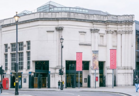
Venturi Scott-Brown’s National Gallery Sainsbury Wing extension (1991) was born into a precarious no-man’s land between the warring camps of neo-modernists and traditionalists who had been tussling over the direction of Britain’s cities for much of the prior decade. The site of the extension had come to be one of the most symbolic battlefields in British architecture since a campaign to halt its redevelopment with a Hi-Tech scheme by Ahrends Burton Koralek had led to that project’s refusal at planning in 1984.
This was precipitated by Prince Charles spectacularly wading into the debate with a speech he gave at the 150th anniversary of the Royal Institute of British Architects. Scheduled to simply introduce and award the RIBA Gold medal that year to Charles Correa, he instead launched a broadside on the state of British Architecture, with the fate of the Sainsbury extension positioned as the symbolic apogee of the profession’s dire condition, beginning his attack by proclaiming that the ABK scheme was “like a monstrous carbuncle on the face of a much loved and elegant friend.”
Venturi Scott Brown, the winners of the following competition that was intended to appease the warring factions, worked up and delivered one of the most – if not the most – sophisticated pieces of public architecture to have been built in the Postmodern idiom. It achieves what only a building composed along Postmodern lines could hope to achieve with such vigour, namely a tense and at times thrilling meeting of modernism, contemporary construction, English classicism, steel, stone and glass, symbolism, context and spatial creativity.
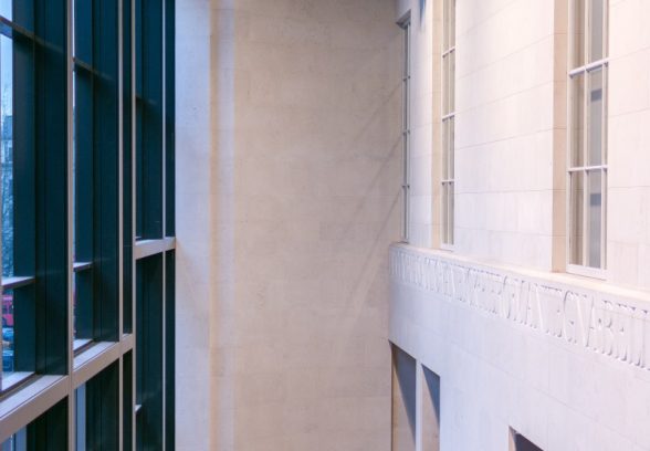
It is a building that fits in, while simultaneously signalling its novelty, a manoeuvre best summarised by the “echo façade” facing Trafalgar Square that repeats the rhythms and forms of the main Gallery building, but steadily erodes them, progressively reducing their depth and presence, until they fade away completely once the building has turned the corner. It also presents diversely textured elevations to all the streets it faces, never hiding its size, but moderating it with interest whether it be through the deployment of polychromatic cast-iron columns, London brick, a modernist glazed wall, or supergraphic-scaled epigraphy.
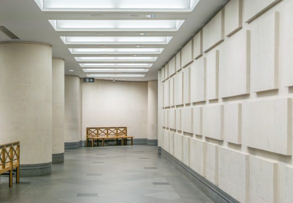
The internal scheme is also a bravura resolution of conflicting demands. With their grand enfilade of arches the upper galleries simultaneously recall the ecclesiastical scale of a Florentine church, appropriate for the collection’s altar pieces, whilst laterally breaking down to the intimate proportions of a more domestic setting, appropriate for the private devotional works that make up much of the collection. The two scales co-exist with a successful simultaneity in the interlinked gallery spaces, all of which are unified in a content-specific, calming language of Brunelleschi-Florentine grey stone, wood and white render.
It was a requirement that the early renaissance galleries be placed on the second level to align with the galleries of the main building next door, and Venturi Scott Brown harnessed the arrangement to create a vertical sandwich of programs, all of which are united by a grand staircase reminiscent of the Cortile Stairs in an Italian Palazzo.
Visitors journey from the street through a small entrance into a tight, almost exaggeratedly compressed, low-ceilinged ground floor space, whose rear wall emphasises the feeling of being “underneath” through its large, façade-scale Portland stone rustication. The weightiness of this reception is then powerfully contrasted by the generosity of the stairs that one enters to either rise towards the other programs and the renaissance galleries above, or descend into the temporary exhibition spaces below.
It is an essay in how to turn conflicting demands (of being contextual, of being modern, of showing creativity and of showing restraint) to one’s advantage. It should have been the proof that buildings need not be dogmatic, that they do not have to be straight-up revivalist to fit in, nor do they have to be aggressively modern and anti-contextual to be contemporary and creative. Instead of being proof of Postmodernism’s efficacy it was, in Britain at least – just at its moment of greatest triumph – the death knell for any such approach.
As Thatcher said, “standing in the middle of the road is very dangerous; you get knocked down by the traffic from both sides,” a metaphor apt for the manner in which the Sainsbury Wing was received upon completion. The totalitarian viewpoint of both the traditionalists and the neo-modernists rejected Venturi Scott Brown’s design as compromised and untrue to tradition on the one hand, and as pastiche “picturesque mediocre slime” on the other. The clever, rich and productive complexity of Postmodernism’s opportunistic and creative navigation of conflicting requirements, was cast as degenerate and facile by both camps.
Charles Jencks points out how closely the opposing modernists and revivalists were positioned in terms of their shared totalitarian spirit in his essay “Death for Rebirth”:
When he [Prince Charles] attacked the original scheme for extending London’s National Gallery , he rephrased the Modernist’s plea for consistency: “I would understand better this kind of Hi-Tech approach if you demolished the whole of Trafalgar Square and started again with a single architect for the entire layout” … The implication, with its heavy irony, is that a whole lot of aesthetically unified carbuncles would be acceptable.
The Postmodern opposition to this spirit of universal cohesion, of a universal singular solution applicable to all projects, a position shared by modernists and revivalists alike, was architecturally embodied at its best, and for the first time at a civic scale, in the Sainsbury Wing as built. This middle way as signalled by Venturi Scott-Brown, in which context is recognised but without resorting to revivalism, has been accepted as given by all practicing architects in the intervening years. Accepted, but taken up in a form entirely devoid of Postmodernism’s complexity and playfulness, in a kind of planner-friendly modernist-contextual rigor mortis.
The full spectrum of architectural intelligence, complexity, wit and richness that was brought to bear in the composition of works such as the Sainsbury Wing, an approach that was labelled “postmodern,” has however been rendered taboo, along with appreciation of this seminal milestone in British public architecture. This is a wonderful and important building, that together with the style it represents, needs, deserves – demands – a robust critical revaluation.
Adam Nathaniel Furman, designer, writer and lecturer; author of Style: In Defence of Postmodernism
Photos © Valentino Danilo Matteis
References
“Death for Rebirth” by Charles Jencks, AD “Post-Modernism on Trial” 1990
“In Defence of the Sainsbury Wing”, BD, 22nd July 2011, Ellis Woodman and Denise Scott Brown
Look for past Buildings of the Month by entering the name of an individual building or architect or browsing the drop down list.

Become a C20 member today and help save our modern design heritage.