This website uses cookies
This website uses cookies to enable it to function properly and to analyse how the website is used. Please click 'Close' to accept and continue using the website.


Courtesy Paul Catherall
If you missed our virtual event with artist and illustrator Paul Catherall you can rewatch it here.
For any information about Paul’s work, you can email info@paulcatherall.com
On the occasion of the talk, we re-published the below article from our 2019/1 magazine issue which featured Paul’s print of the Welbeck Street car park on the cover. In the feature below, our director Catherine wrote about meeting the artist and discovering more about his work.
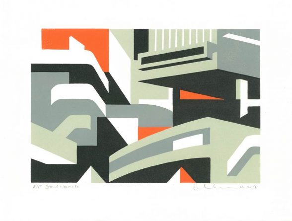
We’ve also launched a limited edition Paul Catherall x C20 canvas tote bag, featuring one of Paul’s favourite works: Southbank Magenta, now available to pre-order in our e-shop.
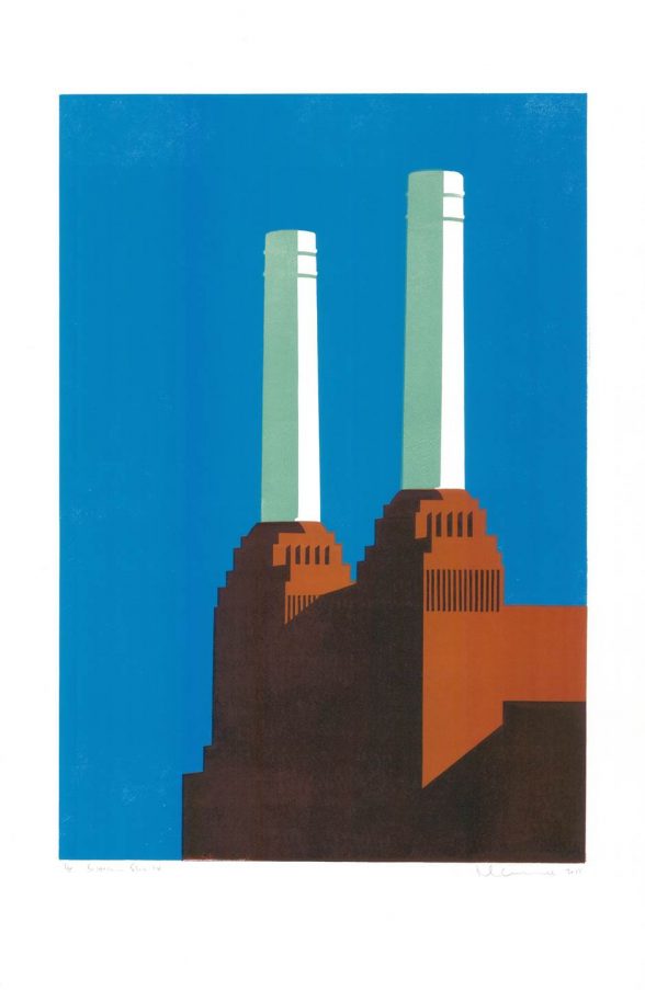
Paul Catherall ‘s prints are often portraits of buildings C20 has visited or campaigned to protect, such as the National Theatre, Battersea Power Station, Bankside (aka Tate Modern) and Balfron Tower. However, some of his largest and most recent works take an expanded view of a wide slice of London cityscape, or collage several buildings (such as New York skyscrapers, or the works of Colin St John Wilson).
Although he clearly has a special fondness for brutalism (and picks the National Theatre as his favourite building), Paul is interested in inter war buildings too, especially the mammoth scale of Giles Gilbert Scott’s craggy brickwork, or Art Deco facades. He’s drawn to buildings with dramatic silhouettes, especially ones whose bold shadows emphasise sculptural form. While his choice of colours sometimes reflects a building’s materials, he often uses vibrant shades such as pink, orange or turquoise which are quite the opposite of stone or concrete’s natural palette. Although he’s now based in London, Paul was brought up in Coventry.
Courtesy Paul Catherall
There had never been an artist in his family, and though he admired Cezanne and enjoyed sketching, he felt he needed
to follow a more practical career. He feels that Coventry’s rich 20th century architectural legacy must have been at least a subconscious influence, but he didn’t spend his teenage years sketching the city’s post-war buildings; he was more interested in drawing figures. ‘Being a war artist or a court illustrator really appealed and, not knowing about restrictions, I practised at Wood Green court. I was spotted by the judge and asked to leave, so after that I just drew people in the local library – that was much safer.’ He studied illustration at Leicester Polytechnic and started out as a commercial illustrator, working mainly in acrylics, and doing figurative work. His clients included newspapers and publishers, but he also did pub signs for
Marston’s Brewery. His early book covers included several Barry Unsworth novels and reissues of Enid Blyton schoolgirl stories. He was moderately successful, but it was hard work: ‘It was the late 1980s and 90s, and before the internet there was no alternative to hawking round my portfolio to get work.’ More recently, his distinctive linocut look has been actively sought out by companies wanting a retro feel for their brand, with a steady run of book cover commissions and some product packaging too.
Paul didn’t turn to linocutting professionally until he was in his thirties, although he had previously enjoyed printmaking as a student. By the late 1990s he was looking for a new direction.
Courtesy Paul Catherall
Inspired by the rapidly changing skyline of London, he wanted to capture the sense of energy and invention as new buildings went up and key landmarks were renovated. His first architectural linocut was of the Millennium Dome (now the O2), then under construction. This was an exciting time, but he clearly has reservations and didn’t want to celebrate new construction uncritically. The linocut process was a welcome contrast to the high-tech systems of millennial architecture: ‘I loved being able to re-create the feel of old lithographic travel posters at home, like a cottage industry.’
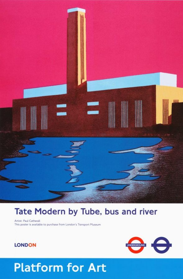
It was a poster he designed for one of his first linocut shows that gave his work wider recognition. It caught the attention of Michael Walton, responsible for commissioning new posters for Transport for London. Several of the artists that Paul cites as influences produced still-popular posters for TfL’s predecessors, so it’s not surprising that Walton thought his style would work well now. Familiar artists included Frank Newbould, whose Chestnut Time at Hampton Court – using just three colours – dates back to 1922, and Tom Eckersley, who did posters from the 1930s through to the 1980s. Paul’s first TfL commission was an image of Tate Modern, and he has now done 22 posters for them.
Courtesy Paul Catherall
He describes his prints as ‘almost pretending not to be linocuts’, as while lino prints often make a point of being less than totally precise, he works with a meticulous, clean rigour, carefully marking and measuring to ensure that each colour registers accurately, and wiping any excess colour from each block before printing.
He loves the discipline of the process, a big departure from his ‘fast and spontaneous’ earlier work. Each print starts out with pencil sketches, initially on site, exploring different angles. Then he uses small painted roughs to consider colours, before planning the details of the printing process. The image is enlarged to its final size at a print shop, then traced off and further refined.
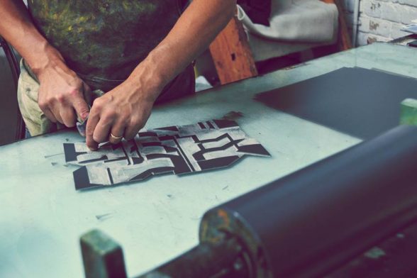
Although he uses photographs as reference images, he always flattens out the image to remove any distortion. His tracings on paper are then transferred to fresh sheets of regular flooring lino, and blocks are cut by hand. Most images will have between three and six colours, and generally each colour will have a separate block, although sometimes he cannibalises early-stage blocks to make later ones to take another colour, by cutting away more ground.
Courtesy Paul Catherall
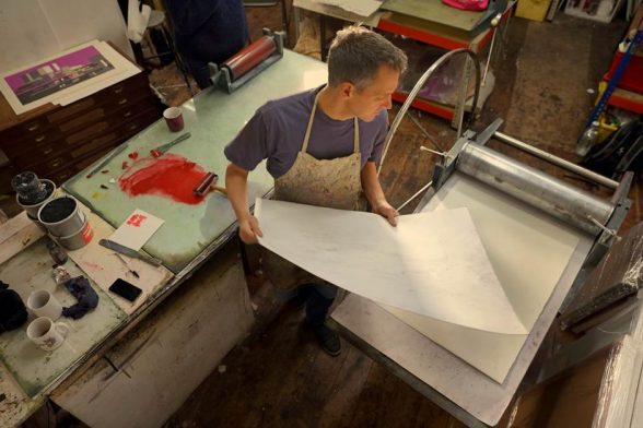
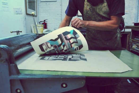
Up to this point the process can happen at home, and when he calls by the C20 office he has with him a gorgeously-smelling sheet on which the knife and gouge marks can be clearly seen. He does all his own printing at Artichoke, a print studio in South London, printing the entire run of an image, one colour at a time. He welcomes the strenuous activity of working the KB flatbed press, which was designed by an American aircraft engineer and has the aesthetic to prove it. A full run of an image can take up to eight weeks to complete. He uses oil-based litho inks which he mixes and thins with a transparent white extender (which looks like glue) on a glass table. It needs to warm up and loosen before he uses a large hand-roller to transfer it to the block:
‘If it’s making a shhhhh sound, I know it’s ready.’ While cutting is stressful as mistakes can’t be undone, the printing process is more forgiving. He deliberately cuts blocks to give a small overlap between colours, eliminating white lines between matt areas of solid colour and creating a sheen along the join which he particularly likes.
Courtesy Paul Catherall
Occasionally a block gets misaligned or even printed upside down: ‘I hang on to those… they give me ideas for more abstract work.’
With Coventry set to be City of Culture in 2021, he’s been returning to his teenage haunts: ‘I’ve always planned on doing a set of Coventry prints – I’ve been back a few times and got quite a lot of photo references to work from, and now I’ve a proper deadline to get them done.’ Among his favourites is the 1977 zinc-panelled Elephant sports centre (the C20 website’s Building of the Month in April 2015): ‘It’s such an iconic and original building, I remember waiting for the bus outside after swimming, looking forward to chips on the way home.’ Even though his work will still be grounded in his personal take on a traditional process, he’s increasingly looking at less familiar buildings, and from more unusual angles, so rather than a front-on view, he’s thinking of a ‘between the Elephant’s legs’ composition that includes the overhead ring-road adjacent. He’s also fond of the William Mitchell concrete mural at the Three Tonnes pub (now a chicken shop).
‘That would definitely translate well to print – I just need to find a way to put my own spin on it.’
Become a C20 member today and help save our modern design heritage.
Comments