This website uses cookies
This website uses cookies to enable it to function properly and to analyse how the website is used. Please click 'Close' to accept and continue using the website.


Catherine Loewenthal Jones, Social Media Officer for C20 West Midlands, reports on their recent visit to two Richard Gilbert Scott churches.
It was a foul January day, freezing wind and even colder snow and sleet was chucking it down when the hardy folk of C20 West Midlands met up outside the Church of St Thomas Moore in Sheldon, not far from Birmingham airport. Standing in bobble hats, thick gloves and clutching cameras and phones we were introduced to the work of Richard Gilbert Scott, grandson of the founding dynasty of architects. He studied at the Bartlett School and joined the family practice in 1953. His first church project was at Biggin Hill in Kent where he reused the dismantled church to redesign and rebuild. He clearly chose modernism as his ‘go-to’ style. It is fitting that such a pre-eminent architect who only died last year, would be the subject of our first West Midlands trip of the year. Katriona Byrne and Cristina Gardiner from Historic England gave a detailed and fascinating introduction to the church and his work and in particular the challenges of renovating a relatively new building and the issues it raised. Should one match concrete with the original colour or its current one? Does it matter if one doesn’t clean and return the concrete to its original colour? How much should one intervene on preservation of stained glass? How does one balance the needs of the community and the church’s constant use and the preservation of the building?
Planned and built in the 1960s, (work commenced in 1966), it was opened in January 1970 and listed grade II in 2012. In fact the project was first undertaken by other members of his family business, but he inherited it on his uncle Adrian’s death in 1962. It was clear that the local diocese was happy to give free rein on the design “as long as it was cheap”.
Birmingham absorbed many Irish Catholic immigrants in the 1950s and 60s and they needed new places to worship. The new concepts for both church design and liturgy as set out in Vatican II are clearly in place in St Thomas Moore – the raised altar in the fan shaped church building is flanked by the baptistery and lady chapel beyond the spread arch of congregation area. Light from the skylights and windows under the roof, and bright and experimental stained glass by John Christian brighten and lift- so different to the dark and gloomy, and very much separated congregation and priest of earlier styles of Catholic churches.
For me I was challenged by the external design of the building. Does it have a tower or a steeple? Does it matter? It slices through the air and at the same time sits relatively squat in the environment- the gaps in the point leave a rather satisfying elusive ambiguity as one circles the building looking for a view. (How does one mark it on an Ordinance Survey map?)
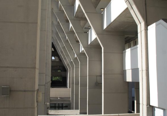
And the quality of the slabs of concrete holding up the entrance with detailed finishes was so tactile. We forget how concrete can be an irresistible material crying out for our fingers to run on it. The somewhat prosaic, touch of Soviet bus shelter, entrance, is improved vastly by the use of good quality detail.
The blues of the stained glass- an experimental technique which looked as if crushed glass was embedded into the surface, creates calming diffused light that falls over the fanned out congregation. However the technique John Chrestien used fascinated me but it was clear it was not a “safe” technique- much of it had degraded and some sections were totally lost.
I wondered about the shades of blue paint above the altar. Were the colours the originals? There was a whiff of public conveniences in the shades which was a little disappointing As an artist, I felt a little let down rather than uplifted. Much of the main windows stained glass though was beautiful, even if some had been badly renovated but despite this, I was drawn to the overlapping circles, almost Venn diagrams, reminding us of the overlapping circles of life, circles of hell, as well as the triptych of Father, Son and Holy Spirit. The use of touches of orange scarlet red within the predominantly shades of blues and greys of the more conventional stained glass really lifted the design.
The next church we visited was another Richard Gilbert Scott design which is currently being renovated under the supervision of APEC Architects. I am most grateful to James Phillips for his comments on the building and the work being carried out on Our Lady Help of Christians at Tile Cross (also known as Kitts Green).
Gavin Stamp stated that the building is very hard to categorise – but what is definitely true is that it is a perfect blend of art, design, architecture, engineering and probably one of the most exciting pieces of 20th century British church architecture I’ve had the pleasure to look at. The upwards sweep of the roof/tower/steeple, copper impregnated and now an oxidised green is almost a wonder of the 20th century architecture world, and certainly a defining image of 1960s design.
The church was recognised as being something very special as early as 1999 when it was first listed and upgraded to II* in 2016. A perfect example of putting into practice the recommendations of Vatican II, its interior is remarkably intact. The stained glass, also by John Chrestien, is all of a more conventional construction, and in glorious technicolour for the most part. However the sections I was most drawn to were the multiple textured clear glass panels which were stunning in their creative use of materials. The limited colour windows were also remarkable- blue, black, red and repeated use of a mix of textured clear glass was so effective and dramatic.
We were fortunate to have James tell us about the history of the building and in particular the challenges of working on the renovation, in particular finding contemporary materials for those that are no longer available. He also had researched the history of the design and we were privileged to see images of the thought and design process Richard Scott Gilbert went through to lead to the final design accepted by the diocese.
Our Lady Help of Christians is an incredible amalgamation of art, architecture and engineering. Even now, 50 years on, it is hard to fathom how the dramatic in-situ concrete forms were created; something that would be a challenge now, even with the significant advances in design and construction technologies. Richard Gilbert Scott’s attention to detail is clear to see in every part of the building, from ironmongery and seating to the different textures of concrete used on separate part of the concrete frame. Everything works together to form an awe-inspiring, sacred, space. The building came at a time when the changes brought about by Vatican II radically altered the form and liturgy of catholic churches. Richard Gilbert Scott’s vision, which he stuck to despite concerns from clergy, created a building that embodies all of the benefits of these changes, and has proven to be an incredibly successful form for worship.
The challenges we faced:
Almost all of the repair work we are carrying out on the building is as a result of defects caused by limitations of the original construction, failure of products used and environmental deterioration. The biggest challenge faced was finding a material to re-roof the building with; the original covering (a copper foil faced bitumen sheet) is no longer manufactured. This required a long period of research to find a product that would be appropriate, both technically and aesthetically. The existing roof presented a number of challenges; it curves in two directions and goes from flat to vertical, meaning the use of sheet metals would not work. Its location (near the end of Birmingham Airport’s runway) meant that the roof was subject to deterioration from aviation fuel, and the shape of the roof created strong uplift forces on it’s covering. The existing bitumen covering had also bonded with the concrete below, making it impossible to remove without damaging the concrete. With the assistance of Historic England, through visiting the original architectural drawings at the RIBA & V&A archive and by carrying out a series of tests on site, we arrived at a solution; a liquid membrane product that will protect the concrete structure for a long time to come, whilst respecting the significant form of the existing building.
He sums up the building perfectly:
‘It is such a remarkable building, I would strongly recommend anyone interested in 20th century architecture should make a pilgrimage to see if once the renovations are complete.’

Become a C20 member today and help save our modern design heritage.