This website uses cookies
This website uses cookies to enable it to function properly and to analyse how the website is used. Please click 'Close' to accept and continue using the website.


December 2021 - Aviva HQ, York
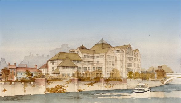
Image: Brian Paul.
Hurd Rolland Partnership (1993)
The history of the City of York is told through its magnificent architecture: from the fragments of Roman wall to the medieval Minster and the exemplary buildings from all eras since. Yet a period considerably overlooked in the tale of York’s architecture is its most recent: post-WWII buildings may not always fit into the city’s reputation as a historic location. This is precisely the issue which the Aviva building, set in a prominent position on the River Ouse by Lendal Bridge, attempts to tackle. This vast office space has been the headquarters of several successors of General Accident Life Insurance, now Aviva, since its completion in 1993. Designed by Scottish practice Hurd Rolland Partnership, led by architect Brian Paul (educated at the University of Dundee), the most notable feature of this building must be how it attempts to integrate with the character of the city, and the new story it tells about York as a result.
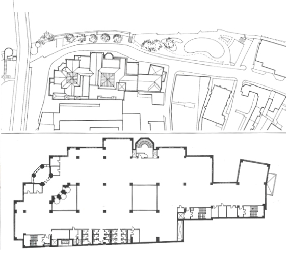
Image: Building, amended by Finn Walsh 2021.
The Aviva building is striking in silhouette, with a diverse roofline and façade giving the impression of this being several buildings combined into one. Yet the entire site is connected by its uniformity of material and detail, with all elements from the chamfered tower to the gatehouse-like entrance framed by a rusticated ground floor and slate roof, with mullion-and-transom windows regularly punctuating the façade. The office has been explicitly designed to refer to the traditional architecture of York; it utilises the same local magnesian limestone as the contemporary renovation of the Minster, while the gabled roofline mirrors the medieval Guildhall across the Ouse. Articles written about the offices in the early 1990s by Martin Spring and Patrick Nuttgens (respectively in Architecture Today and Building) applaud how well the building fits in with the local aesthetic and defers to the city’s architectural heritage – but this design was not entirely without criticism. The Architectural Review’s regular ‘Outrage’ feature was dedicated to the offices, with Peter Davey calling the “meaningless jumble of forms and volumes… [a] prime example of widespread architectural malaise”. Davey’s specific criticism was of the “wrapping paper” of stone around the steel structure, suggesting the building was an exercise in “scenery design” rather than architecture.
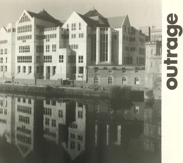
Photo: Architectural Review.
This might be best considered in contrast with another building along the Ouse, the nearby Park Inn Hotel (previously the Viking Hotel by Fitzroy Robinson & Partners, 1968). Park Inn seemingly pays little heed to its neighbouring buildings, as a piece of brick modernism with little formal relation to ancient York, and rivalling the Minster in height. And yet, its unapologetic modernism might appeal to some; the Aviva offices are modern but hesitate to show it, and its attempt to appear ancient can therefore feel disingenuous. This begs the question of what modernism can look like in York, as the Park Inn remains unpopular and is considered a detractor by many, including the City Council, but the Aviva offices are only skin-deep in their attempt to become a part of the ancient city.

Photo: Patrick Nuttgens/Keith Gibson/Studio Vista.
The building could have been an explicitly modern expression of York’s step into a financialised future – pertinent given the industrial history of the location as the 1864 Rowntree factory – but instead chose to look back and refer to the city’s medieval, Victorian and Georgian heritage. The architect, Brian Paul, who spoke to me earlier in the year, wanted to have only an element of tradition in what would have been a much more modern building, with a series of “tumble down masonry cubes” whose “informal stacking would create a traditional skyline” – similar to the lowest parts of the building on Tanner Row. The emphasis on a wholly traditional exterior instead came from the York Civic Trust and the then head of Planning, Costas Georgio. Thus the architects introduced elements such as the gables and mullion-and-transom windows. Perhaps the Scottish firm looked to their own Charles Rennie Mackintosh; note the details in the central gable, for example.
The design also took from York’s local vernacular as well as taking cues from country houses by the likes of Robert Smythson. At the time of its completion, Jim Stevenson, a partner at Hurd Rolland, summed up the philosophy of its design in Building magazine, that “each place has its own style,” and “a building should belong to the city it stands in”. Historical references – especially to York’s existing architecture – satisfied the Civic Trust, but led to a muted response from the Royal Fine Art Commission who had earlier approved the more modernist design. This design could therefore be characterised as a wary modernism, held back by too many authors with different agendas.
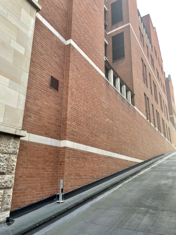
Photo: Joshua Mardell.
Of course that’s only one reading of the building, and it could certainly be argued that it is in fact an unbridled success. The Aviva building is undoubtedly of York – it would look thoroughly out of place in any other city in the UK, and is inherently local in its material and detail. The city’s experience with challenging pieces of modernism such as Park Inn led to the necessity for an intelligent design which weaved through multiple briefs. Its modernism does not stray into the perceived arrogance of Park Inn but uses ornament to the excess to make it feel unapologetically like a part of York. Modernists may have been outraged by its facadism – and perhaps still are – but the Aviva building should not be ashamed of its attempt to combine the city’s medieval vernacular with a contemporary vision of the city, even if it is only a stepping stone towards a distinctly York brand of modernism that is daringly new and complements its ancient setting.
Whichever way one chooses to view the Aviva Building, it is important that it is looked at and considered an important part of York’s twentieth century architectural history. As an attempt to bring together ancient and modern, our response to it reveals how we conceptualise the city’s heritage. A complex discussion, from residents and the scholarly community, is essential to grasping what it means for a building to be a York building, and how we want our twentieth century, and now twenty-first century buildings to respond to the city.
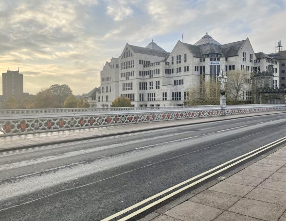
Photo: Joshua Mardell.
Finn Walsh is a recent graduate in History of Art from the University of York, now working in communications for the built environment. This research began as part of the University of York Department of History of Art’s ‘York C20’ project, which seeks to foreground York’s hitherto forgotten and misunderstood C20 architectural heritage – a new online gazetteer is forthcoming. The Building of the Month is edited by Dr. Joshua Mardell (@Walush2)
Sources:
Peter Davey. “Outrage.” Architectural Review, 195, no. 1163 (1994): 17.
Hurd Rolland Chartered Architects. “General Accident HQ, York.” Hurd Rolland. 2016:
Patrick Nuttgens. “Stepping stones: Hurd Rolland in York.” Architecture Today, 45 (1994): 20-23.
Patrick Nuttgens. York. London: Studio Vista, 1970.
Martin Spring. “York Rose.” Building, 258 (1993): 32-36.
Unfortunately, due to a fire at the Hurd Rolland archives in April 2013, all records and drawings of the design process for this building were lost. Many thanks to Diane Brown of Hurd Rolland, and to the architect Brian Paul for his help in providing his illustration and a wealth of information.
Look for past Buildings of the Month by entering the name of an individual building or architect or browsing the drop down list.

Become a C20 member today and help save our modern design heritage.