This website uses cookies
This website uses cookies to enable it to function properly and to analyse how the website is used. Please click 'Close' to accept and continue using the website.


February 2013 - Greenock Library
John Kennedy
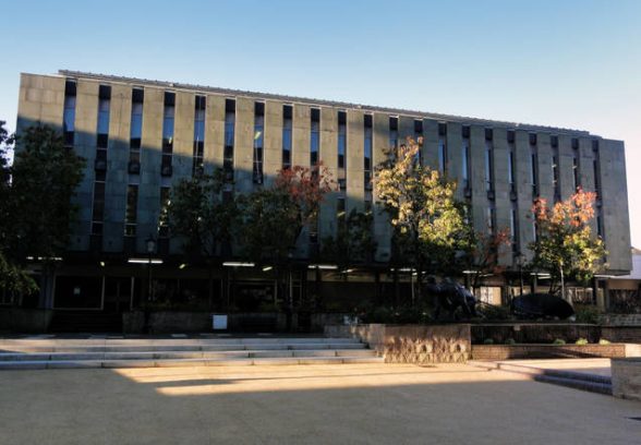
Located in Greenock, a large post-industrial town situated near Glasgow on the south bank of the River Clyde, Greenock Central Library was built in 1970. Positioned within a complex urban setting, the Central Library sits on the edge of Clyde Square opposite the town’s Municipal Buildings.
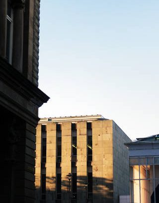
Surrounded by several very fine Georgian and Victorian buildings, the Municipal Buildings are a large complex of town halls and offices, completed in 1886 after an architectural competition judged by the architect Charles Barry Junior, son of the architect of the Palace of Westminster. Displaying a similar grandeur to the competition juror’s father, the yellow sandstone Municipal Buildings are designed in an extravagant Renaissance style which is distinguished by the Victoria Tower, an extremely tall landmark visible across the district.
So ornate were the proposals that the local merchants who helped fund their construction criticised the Municipal Buildings as exhibiting ‘every beauty except the beauty of economy’. However, the Central Library which was built almost a century later manages to respond appropriately to its rich context with a restrained and sensitive architectural character.
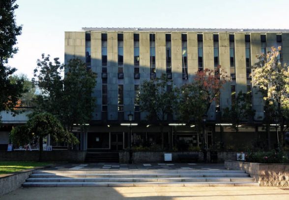
Designed by James Watson, the Burgh Architect and Town Planning Officer in Greenock, the Library is a formal composition of three elements. The most prominent is a rectilinear volume of two storeys, which contains the book-stacks, reading spaces, a large children’s library, as well as studies and office areas. This volume is clad in pilaster-like verticals of pearlescent green slate, with narrow windows between. The slate cladding is particularly distinctive and unusual, given the propensity of contemporary architects towards using concrete panels. In the frequently wet weather, the Library’s cladding glows through the rain on its surface, and the whole building has aged extremely well with none of the unsightly weathering stains which blemish so many buildings of its period and location.
This rather classical pattern of an alternating solid and void perimeter wall is perhaps evocative of the Library’s contents. In the words of Frank Arneil Walker in The South Clyde Estuary: An Illustrated Architectural Guide to Inverclyde and Renfrew, ‘its book-end fenestration drawing a striated curtain along the south side of the square’. The stripped-classicism of the Library’s elevation is an elegant counterpoint to the ebullient Renaissance style of the Municipal Buildings directly opposite.
Therefore, while still engaging with its urban context, the facade treatment lends the library volume a strong sense of autonomy and compression, which is literally heightened by raising and partially cantilevering this volume from a podium of one storey in height. This podium fully encloses the Square on its north side, conveniently screening the dignified civic spaces around the Municipal Buildings from a car-park located on the Library’s south side. Because the podium is considerably longer than the Library volume, an overly generous (usually empty) square piazza is positioned in front of the Library’s entrance. Finished in durable concrete panels, this podium contains a row of shops and a pub.
Customers of these shops are protected from the frequently wet and inclement weather by the overhanging Library volume above, which creates a cloister-like walk along the edge of the landscaped square, and which can be seen as a minimalist interpretation of the classical arcade found in the Municipal Buildings opposite.
The third element of the Library’s composition comprises two approach ramps which allow access to the Library’s entrance on the podium. These ramps are both fine sculptural objects but their extreme length, on account of the need to convey the visitor up one storey via a disabled-friendly route, are frequently criticised as hampering access to what should be the most publicly accessible building in the town.
However, both approach ramps amply reward the effort of those who use them: each ramp seems to have been positioned in orientations calculated to provide the visitor with enhanced vistas and perspectives of the Library, the Municipal Buildings, Greenock’s surprisingly fine skyline of towers and spires, the river Clyde, and the mountain ranges of Argyle beyond.
Formed from exposed concrete, the first ramp, which is entered from a street to the south of the Library, is typical of the then prevalent ideas regarding deck-access, and which guides the visitor along a formal axis to the raised piazza from which the Library is entered. The second ramp is located within the Square, and adopts the highly memorable form of a concrete spiral. This swooping ramp curls up to the Library’s entrance, bringing one into close contact with several mature trees within the Square, and unrolling to the ascending visitor an architectural panorama in 360 degrees of Greenock’s finest Victorian townscape.
Recalling the ramp in Tecton’s Penguin Pool of 1938, this ramp provides the Square with a joyous architectural sculpture in white-painted concrete, which balances discretely against a figurative piece of public sculpture, in black-painted bronze, at the centre of the Square. Inspired by the paintings of Stanley Spencer, this sculpture shows a group of workers hauling a newly forged anchor-piece, in homage to the British shipbuilding industry which had its epicentre only a few hundred metres from the Library.
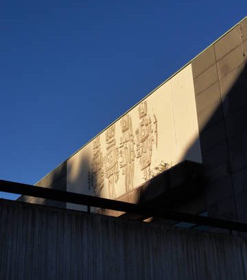
These two sculptures are not the only pieces of art included within the Library, which is unusually well appointed with decorative art. Above the entrance to the Library, on the exterior, is a large frieze of four fibreglass panels by the noted sculptor Charles Anderson, which is characterised by abstract cubist motifs and patterns. Internally, the book stacks, walls and ceiling are finished in warm timber. An atrium at the centre of the Library displays ornate metal-work also by Charles Anderson, and this atrium features another spiral, this time a delightfully creaking timber staircase.
Encouraging an air of quiet, the interior is softly lit and the generous spaces provide an extremely calm and comfortable space in which to read. A large children’s library is enclosed on the second floor to allow for noisier groups, and this ensures the Library is not merely an intimidating reading room reserved for adults.
Like the Municipal Buildings opposite, the design of the Central Library is indicative of Greenock’s historical aspiration for an architectural quality unexpectedly disproportionate to the industrial town’s tough reputation. It is therefore not unreasonable to suggest comparisons with more famous contemporary buildings.
For example, the compact volume of the slate clad library-box is broadly suggestive of the earlier Beinecke Rare Book Library at Yale University, designed in 1963 by Gordon Bunshaft of Skidmore, Owings & Merrill. Like Greenock Central Library, the Beinecke Library is an autonomous form within a campus, and consists of a classical composition of a vault clad in thin planes of fine stone, which is elevated to create a cloistered perimeter below. Formal, cubic spaces around the Beinecke Library are defined by a small number of emphatic design moves.
More local similarities are to be found at the Hillhead Public Library in Glasgow, which treats its elevation in a similar manner. Though occupying a gap site within a Victorian street frontage, the Hillhead Library interior is screened by a repetitive facade of lancet windows between pre-cast concrete pilasters. This similarity of elevation is made even more apparent by the bas relief of cubist motifs, executed in concrete, which signifies the main entrance to the Hillhead Library. Warm timber and metalwork also characterises the interior.
Sadly however, Greenock Central Library is almost unrecorded and unlisted, and this superb building is no longer a library. Some of the Central Library’s large collection of books were transferred in 2012 to a nearby shop unit, which is apparently to act as a new library. Although the Library was frequently used, proposals have been prepared for new council offices to be inserted into the Central Library, which may cause irreparable modification to the elevations, as well as the almost complete loss of the well-designed interior.
UPDATE: As of May 2024, the building is scheduled for demolition and the site redeveloped for housing.
John Kennedy completed a Masters in Architecture at the University of Strathclyde in 2012, and is currently researching the work of Powell & Moya.
Look for past Buildings of the Month by entering the name of an individual building or architect or browsing the drop down list.
Become a C20 member today and help save our modern design heritage.